CSS3简介 浏览器私有前缀 在书写CSS3属性的时候,可能需要在属性前面加上浏览器的私有前缀,然后该浏览器才能识别对应的CSS3属性。
私有前缀
对应的浏览器
-webkit-
Chrome和Safari
-moz-
Firefox
-ms-
IE
-o-
Opera
举个例子,如果我们想要使用CSS3来实现边框阴影效果,可能会这样写:box-shadow : 5px 5px 10px red;box-shadow 这个属性,例如Chrome只能识别-webkit-box-shadow (前缀为-webkit-),而Firefox只能识别-moz-box-radius(前缀为-moz-)。因此,如果想要让所有主流浏览器都能实现边框阴影效果,我们需要这样写:box-shadow : 5px 5px 10px red;box-shadow : 5px 5px 10px red;box-shadow : 5px 5px 10px red;box-shadow : 5px 5px 10px red;box-shadow : 5px 5px 举个例子,如果我们想要使用CSS3来实现边框阴影效果,可能会这样写:box-shadow : 5px 5px 10px red;box-shadow 这个属性,例如Chrome只能识别-webkit-box-shadow (前缀为-webkit-),而Firefox只能识别-moz-box-radius(前缀为-moz-)。因此,如果想要让所有主流浏览器都能实现边框阴影效果,我们需要这样写:box-shadow : 5px 5px 10px red;box-shadow : 5px 5px 10px red;box-shadow : 5px 5px 10px red;box-shadow : 5px 5px 10px red;box-shadow : 5px 5px 10px red;
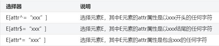
新选择器 属性选择器
//举例padding :0 ;margin :0 ;}ul {list-style-type :none;}a display :inline-block;font-size :12px ;height :20px ;line-height :20px ;a [href$="doc" ] ::before content :url ("img/1.png" );a [href$="pdf" ] ::before content :url ("img/2.png" );a [href$="ppt" ] ::before content :url (//举例padding :0 ;margin :0 ;}ul {list-style-type :none;}a display :inline-block;font-size :12px ;height :20px ;line-height :20px ;a [href$="doc" ] ::before content :url ("img/1.png" );a [href$="pdf" ] ::before content :url ("img/2.png" );a [href$="ppt" ] ::before content :url ("img/3.png" );
子元素伪类选择器 :first-child、:last-child、:nth-child(n)、:only-child 用子元素伪类选择器,可以让结构与样式分离,使得用子元素伪类选择器,可以让结构与样式分离,使得HTML 结构更加清晰,更利于后期维护和搜索引擎优化(即SEO)。
选择器
说明
E:first-child
选择父元素下的第一个子元素(该子元素类型为E,以下类同)
E:last-child
选择父元素下的最后一个子元素
E:nth-child(n)
选择父元素下的第n个子元素或奇偶元素,n取值有3种:数字、odd和even,其中n从1开始
E:only-child
选择父元素下唯一的子元素,该父元素只有一个子元素
<-- 隔行换色 --><!DOCTYPE html > <html > <head > <meta charset ="utf-8" /> <title > </title > <style type ="text/css" > *{padding :0 ;margin :0 ;} ul {list-style-type :none;} ul li { height :20px ;} ul li :nth-child (odd) background-color :red; ul li :nth-child (even) background-color :green; </style > </head > <body > <ul > <li > </li > <li > </li > <li > </li > <li > </li > <li > </li > </ul > </body > </<-- 隔行换色 --><!DOCTYPE html > <html > <head > <meta charset ="utf-8" /> <title > </title > <style type ="text/css" > *{padding :0 ;margin :0 ;} ul {list-style-type :none;} ul li { height :20px ;} ul li :nth-child (odd) background-color :red; ul li :nth-child (even) background-color :green; </style > </head > <body > <ul > <li > </li > <li > </li > <li > </li > <li > </li > <li > </li > </ul > </body > </html >
:first-of-type、:last-of-type、:nth-of-type(n)、:only-of-type :first-child 在选择父元素下的子元素时,不仅要区分元素类型,还要求是第一个子元素。而:first-child 在选择父元素下的子元素时,不仅要区分元素类型,还要求是第一个子元素。而:first-of-type 在选择父元素下的子元素时,只需要区分元素类型,不要求是第一个子元素
选择器
说明
E:first-of-type
选择父元素下的第一个E类型的子元素
E:last-of-type
选择父元素下的最后一个E类型的子元素
E:nth-of-type(n)
选择父元素下的第n个E类型的子元素或奇偶元素,n取值有3种:数字、odd和even,n从1开始
E:only-of-type
选择父元素下唯一的E类型的子元素,该父元素可以有多个子元素
UI伪类选择器 对于指定的样式,在默认状态下不起作用,只有当元素处于某种状态时才起作用。 此外,记住一点,大多数对于指定的样式,在默认状态下不起作用,只有当元素处于某种状态时才起作用。 此外,记住一点,大多数UI伪类选择器都是针对表单元素的
:focus 使用:focus 选择器来定义元素获取焦点时使用的样式。不过并不是所有的HTML 元素都有焦点样式,具有“获取焦点”和“失去焦点”特点的元素只有两种。1 )表单元素(按钮、单选框、复选框、文本框、下拉列表)2 )超链接input :focus outline :使用:focus 选择器来定义元素获取焦点时使用的样式。不过并不是所有的HTML 元素都有焦点样式,具有“获取焦点”和“失去焦点”特点的元素只有两种。1 )表单元素(按钮、单选框、复选框、文本框、下拉列表)2 )超链接input :focus outline :1px solid red;
::selection 使用::selection 选择器来定义页面中被选中文本的样式。注意,::selection 选择器使用的是双冒号,而不是单冒号。实际上,单冒号往往都是伪类,而双冒号往往都是伪元素。div ::selection color :white;background-color :red; div ::-moz-selectionbackground-color :red; ::selection {}就可以实现。::selection color :white;background-color :red; 使用::selection 选择器来定义页面中被选中文本的样式。注意,::selection 选择器使用的是双冒号,而不是单冒号。实际上,单冒号往往都是伪类,而双冒号往往都是伪元素。div ::selection color :white;background-color :red; div ::-moz-selectionbackground-color :red; ::selection {}就可以实现。::selection color :white;background-color :red; background-color :red;
:checked 使用:checked 选择器来定义单选框或复选框被选中时的样式。:checked 。input :checked {使用:checked 选择器来定义单选框或复选框被选中时的样式。:checked 。input :checked {background-color : red;
:enabled和:disabled 使用:enabled选择器来定义表单元素“可用”时的样式,也可以使用:disabled选择器来定义表单元素“不可用”时的样式。<head > <meta charset ="utf-8" /> <title > </title > <style type ="text/css" > input :enabled outline :1px solid red; input :disabled background-color :orange; </style > </head > <body > <form > <p > <label for ="enabled" > 可用:</label > <input id ="enabled" type ="text" /> </p > <p > <label for ="disabled" > 禁用:</label > <input id ="disabled" type ="text" disabled /> </p > </form > </使用:enabled选择器来定义表单元素“可用”时的样式,也可以使用:disabled选择器来定义表单元素“不可用”时的样式。<head > <meta charset ="utf-8" /> <title > </title > <style type ="text/css" > input :enabled outline :1px solid red; input :disabled background-color :orange; </style > </head > <body > <form > <p > <label for ="enabled" > 可用:</label > <input id ="enabled" type ="text" /> </p > <p > <label for ="disabled" > 禁用:</label > <input id ="disabled" type ="text" disabled /> </p > </form > </body >
:read-write和:read-only 使用:read-write选择器来定义表单元素“可读写”时的样式,也可以使用:read-only选择器来定义表单元素“只读”时的样式。<head > <meta charset ="utf-8" /> <title > </title > <style type ="text/css" > input :read-write outline :1px solid red; input :read-only background-color :silver; input :-moz-read-write outline :1px solid red; input :-moz-read-only background-color :silver; </style > </head > <body > <form method ="post" > <p > <label for ="txt1" > 读写:</label > <input id ="txt1" type ="text" /> </p > <p > <label for ="txt2" > 只读:</label > <input id ="txt2" type ="text" readonly /> </p > </form > </使用:read-write选择器来定义表单元素“可读写”时的样式,也可以使用:read-only选择器来定义表单元素“只读”时的样式。<head > <meta charset ="utf-8" /> <title > </title > <style type ="text/css" > input :read-write outline :1px solid red; input :read-only background-color :silver; input :-moz-read-write outline :1px solid red; input :-moz-read-only background-color :silver; </style > </head > <body > <form method ="post" > <p > <label for ="txt1" > 读写:</label > <input id ="txt1" type ="text" /> </p > <p > <label for ="txt2" > 只读:</label > <input id ="txt2" type ="text" readonly /> </p > </form > </body >
其他伪类选择器 :root 使用:root 选择器来选择HTML 页面的根元素html 元素来设置,而不是body 元素。:root {background-color :gray;}html {background-color :gray;}:root 选择器来定义整个页面的背景色为灰色,然后将使用:root 选择器来选择HTML 页面的根元素html 元素来设置,而不是body 元素。:root {background-color :gray;}html {background-color :gray;}:root 选择器来定义整个页面的背景色为灰色,然后将body 元素的背景色定义为红色。)
:empty 使用:empty选择器来选择一个“不包含任何子元素和内容”的元素,也就是选择一个空元素。<head > <meta charset ="utf-8" /> <title > </title > <style type ="text/css" > table ,tr ,td border :1px solid silver; td width :60px ; height :60px ; line-height :60px ; text-align :center; background-color : #FFA722 ; td :empty background-color :red; </style > </head > <body > <table > <tr > <td > 2</td > <td > 4</td > <td > 8</td > </tr > <tr > <td > 16</td > <td > 32</td > <td > 64</td > </tr > <tr > <td > 128</td > <td > 256</td > <td > </td > </tr > </table > </使用:empty选择器来选择一个“不包含任何子元素和内容”的元素,也就是选择一个空元素。<head > <meta charset ="utf-8" /> <title > </title > <style type ="text/css" > table ,tr ,td border :1px solid silver; td width :60px ; height :60px ; line-height :60px ; text-align :center; background-color : #FFA722 ; td :empty background-color :red; </style > </head > <body > <table > <tr > <td > 2</td > <td > 4</td > <td > 8</td > </tr > <tr > <td > 16</td > <td > 32</td > <td > 64</td > </tr > <tr > <td > 128</td > <td > 256</td > <td > </td > </tr > </table > </body >
:target :target选择器来选取页面中的某一个target元素。所谓的target元素,指的是id被当成页面的锚点链接来使用的元素。<head > <meta charset ="utf-8" /> <title > </title > <style type ="text/css" > :target h3 color :red; </style > </head > <body > <div > <a href ="#music" > 推荐音乐</a > <br /> <a href ="#movie" > 推荐电影</a > <br /> <a href ="#article" > 推荐文章</a > <br /> </div > <br /> <br /> <br /> <br /> <br /> <br /> <div id ="music" > <h3 > 推荐音乐</h3 > <ul > <li > 林俊杰-被风吹过的夏天</li > <li > 曲婉婷-在我的歌声里</li > <li > 许嵩-灰色头像</li > </ul > </div > <br /> <br /> <br /> <br /> <br /> <br /> <div id ="movie" > <h3 > 推荐电影</h3 > <ul > <li > 蜘蛛侠系列</li > <li > 钢铁侠系统</li > <li > 复仇者联盟</li > </ul > </div > <br /> <br /> <br /> <br /> <br /> <br /> <div id ="article" > <h3 > 推荐文章</h3 > <ul > <li > 朱自清-荷塘月色</li > <li > 余光中-乡愁</li > <li > 鲁迅-阿Q正传</li > </ul > </div > </:target选择器来选取页面中的某一个target元素。所谓的target元素,指的是id被当成页面的锚点链接来使用的元素。<head > <meta charset ="utf-8" /> <title > </title > <style type ="text/css" > :target h3 color :red; </style > </head > <body > <div > <a href ="#music" > 推荐音乐</a > <br /> <a href ="#movie" > 推荐电影</a > <br /> <a href ="#article" > 推荐文章</a > <br /> </div > <br /> <br /> <br /> <br /> <br /> <br /> <div id ="music" > <h3 > 推荐音乐</h3 > <ul > <li > 林俊杰-被风吹过的夏天</li > <li > 曲婉婷-在我的歌声里</li > <li > 许嵩-灰色头像</li > </ul > </div > <br /> <br /> <br /> <br /> <br /> <br /> <div id ="movie" > <h3 > 推荐电影</h3 > <ul > <li > 蜘蛛侠系列</li > <li > 钢铁侠系统</li > <li > 复仇者联盟</li > </ul > </div > <br /> <br /> <br /> <br /> <br /> <br /> <div id ="article" > <h3 > 推荐文章</h3 > <ul > <li > 朱自清-荷塘月色</li > <li > 余光中-乡愁</li > <li > 鲁迅-阿Q正传</li > </ul > </div > </body >
:not() 使用:not()选择器来选取某一个元素之外的所有元素。这个选择器非常重要,在实际开发中用得非常多,大家要重点掌握。<head > <meta charset ="utf-8" /> <title > </title > <style type ="text/css" > *{padding :0 ;margin :0 ;} ul {list-style-type :none;} ul li :not (.first ) color :red; </style > </head > <body > <ul > <li class ="first" > 绿叶学习网</li > <li > 绿叶学习网</li > <li > 绿叶学习网</li > <li > 绿叶学习网</li > </ul > </使用:not()选择器来选取某一个元素之外的所有元素。这个选择器非常重要,在实际开发中用得非常多,大家要重点掌握。<head > <meta charset ="utf-8" /> <title > </title > <style type ="text/css" > *{padding :0 ;margin :0 ;} ul {list-style-type :none;} ul li :not (.first ) color :red; </style > </head > <body > <ul > <li class ="first" > 绿叶学习网</li > <li > 绿叶学习网</li > <li > 绿叶学习网</li > <li > 绿叶学习网</li > </ul > </body >
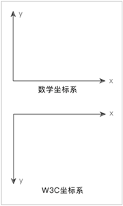
文本样式 文本阴影:text-shadow W3C坐标系
数学坐标系:y轴正方向向上。
W3C坐标系:y轴正方向向下。
text-shadow属性简介 为文本添加阴影效果<!DOCTYPE html > <html > <head > <meta charset ="utf-8" /> <title > </title > <style type ="text/css" > div display : inline-block; padding : 16px ; font-size : 32px ; font-weight : bold; background-color : #CCC ; color : #ddd ; text-shadow : -1px 0 0 #333 , /*向左阴影*/ 0 -1px 0 #333 , 1px 0 0 #333 , 0 1px 0 #333 ; </style > </head > <body > <div > 绿叶学习网</div > </body > </为文本添加阴影效果<!DOCTYPE html > <html > <head > <meta charset ="utf-8" /> <title > </title > <style type ="text/css" > div display : inline-block; padding : 16px ; font-size : 32px ; font-weight : bold; background-color : #CCC ; color : #ddd ; text-shadow : -1px 0 0 #333 , /*向左阴影*/ 0 -1px 0 #333 , 1px 0 0 #333 , 0 1px 0 #333 ; </style > </head > <body > <div > 绿叶学习网</div > </body > </html >
文本描边:text-stroke 给文字添加边框。<!DOCTYPE html > <html > <head > <meta charset ="utf-8" /> <title > </title > <style type ="text/css" > div font-family :Verdana; font-size :50px ; font-weight :bold; color :transparent; text-stroke:2px red; -webkit-text-stroke:2px red; </style > </head > <body > <div > lvyestudy</div > </body > </给文字添加边框。<!DOCTYPE html > <html > <head > <meta charset ="utf-8" /> <title > </title > <style type ="text/css" > div font-family :Verdana; font-size :50px ; font-weight :bold; color :transparent; text-stroke:2px red; -webkit-text-stroke:2px red; </style > </head > <body > <div > lvyestudy</div > </body > </html >
文本溢出:text-overflow 定义文本的溢出样式。<!DOCTYPE html > <html > <head > <title > </title > <style type ="text/css" > div width :200px ; height :100px ; border :1px solid silver; overflow :hidden; white-space :nowrap; text-overflow :ellipsis; </style > </head > <body > <div > 绿叶学习网成立于2015年4月1日,是一个最富有活力的Web技术学习网站。在这里,我们只提供互联网最好的Web技术教程和最佳的学习体验。每一个教程、每一篇文章、甚至每一个知识点,都体现绿叶精品的态度。没有最好,但是我们可以做到更好!</div > </body > </定义文本的溢出样式。<!DOCTYPE html > <html > <head > <title > </title > <style type ="text/css" > div width :200px ; height :100px ; border :1px solid silver; overflow :hidden; white-space :nowrap; text-overflow :ellipsis; </style > </head > <body > <div > 绿叶学习网成立于2015年4月1日,是一个最富有活力的Web技术学习网站。在这里,我们只提供互联网最好的Web技术教程和最佳的学习体验。每一个教程、每一篇文章、甚至每一个知识点,都体现绿叶精品的态度。没有最好,但是我们可以做到更好!</div > </body > </html >
属性值
说明
ellipsis
当文本溢出时,显示省略号,并且隐藏多余的文字
clip
当文本溢出时,不显示省略号,而是将溢出的文字裁切掉
强制换行:word-wrap、word-break
一般情况下,我们只会用到word-wrap:break-word;或word-break:break-all这两个来实现强制换行。
word-wrap
word-wrap:break-word;会首先尝试挪到下一行,看看下一行的宽度够不够,不够的话再进行单词内的断句。
word-wrap属性只有2个取值,如下表所示。
属性值
说明
Normal
自动换行(默认值)
break-word
强制换行
word-break
word-break:break-all不会尝试把长单词挪到下一行,而是直接就进行单词内的断句。
word-break属性有3个取值,如下表所示。
属性值
说明
normal
自动换行(默认值)
break-all
允许在单词内换行
keep-all
只能在半角空格或连字符处换行
嵌入字体:@font-face
可以使用@font-face方法来加载服务器端的字体,从而使得所有用户都能正常显示该字体。不建议使用@font-face来实现嵌入中文字体。这是因为中文字体文件大多数都是10MB以上。这么大的字体文件,会严重影响页面的加载速度,导致用户体验非常差。
@font-face方法不仅可以用于嵌入字体,最重要的还可以实现字体图标技术(即iconfont)
如果想要实现嵌入字体,一般需要以下两步。
①使用@font-face定义字体。
@font-face font-family : 字体名称;src :url (@font-face font-family : 字体名称;src :url (文件路径 );
<!DOCTYPE html > <html > <head > <meta charset ="utf-8" /> <title > </title > <style type ="text/css" > @font-face font-family : myfont; src : url ("css/font/Horst-Blackletter.ttf" ); div font-family :myfont; font-size :60px ; background-color :#ECE2D6 ; color :#626C3D ; padding :20px ; </style > </head > <body > <div > lvyestudy</div > </body > </<!DOCTYPE html > <html > <head > <meta charset ="utf-8" /> <title > </title > <style type ="text/css" > @font-face font-family : myfont; src : url ("css/font/Horst-Blackletter.ttf" ); div font-family :myfont; font-size :60px ; background-color :#ECE2D6 ; color :#626C3D ; padding :20px ; </style > </head > <body > <div > lvyestudy</div > </body > </html >
颜色样式 opacity透明度
我们可以使用opacity属性来定义元素的透明度。
opacity属性取值是一个数值,取值范围为0.0~1.0。其中0.0表示完全透明,1.0表示完全不透明。
opacity属性不仅作用于元素的背景颜色,还会作用于内部所有子元素以及文本内容。
opacity属性大多数时候都是配合:hover来定义鼠标移动到某个按钮或图片上时,改变透明度来呈现动态的效果。
<!DOCTYPE html > <html > <head > <meta charset ="utf-8" /> <title > </title > <style type ="text/css" > a display :inline-block; padding :5px 10px ; font-family :微软雅黑; color :white; background-color :hotpink; cursor :pointer; a :hover opacity :0.6 ; </style > </head > <body > <a > 调试代码</a > </body > </<!DOCTYPE html > <html > <head > <meta charset ="utf-8" /> <title > </title > <style type ="text/css" > a display :inline-block; padding :5px 10px ; font-family :微软雅黑; color :white; background-color :hotpink; cursor :pointer; a :hover opacity :0.6 ; </style > </head > <body > <a > 调试代码</a > </body > </html >
RGBA颜色 RGBA中的透明度只会针对当前设置的属性起作用。
下面几种有关RGBA颜色的写法都是正确的:
rgba(255 , 255 , 0 , 0.5 )50% , 80% , 50% , rgba(255 , 255 , 0 , 0.5 )50% , 80% , 50% , 0.5 )
rgba(R, G, B , rgba(R, G, B , A )
<!DOCTYPE html > <html > <head > <meta charset ="utf-8" /> <title > </title > <style type ="text/css" > *{padding :0 ;margin :0 ;} ul display :inline-block; list-style-type :none; width :200px ; li height :30px ; line-height :30px ; font-size :20px ; font-weight :bold; text-align :center; li :first -child background-color :rgba (255 ,0 ,255 ,1.0 ); li :nth-child (2 ) background-color :rgba (255 ,0 ,255 ,0.6 ); li :last-child background-color :rgba (255 ,0 ,255 ,0.3 ); </style > </head > <body > <ul > <li > 绿叶学习网</li > <li > 绿叶学习网</li > <li > 绿叶学习网</li > </ul > </body > </<!DOCTYPE html > <html > <head > <meta charset ="utf-8" /> <title > </title > <style type ="text/css" > *{padding :0 ;margin :0 ;} ul display :inline-block; list-style-type :none; width :200px ; li height :30px ; line-height :30px ; font-size :20px ; font-weight :bold; text-align :center; li :first -child background-color :rgba (255 ,0 ,255 ,1.0 ); li :nth-child (2 ) background-color :rgba (255 ,0 ,255 ,0.6 ); li :last-child background-color :rgba (255 ,0 ,255 ,0.3 ); </style > </head > <body > <ul > <li > 绿叶学习网</li > <li > 绿叶学习网</li > <li > 绿叶学习网</li > </ul > </body > </html >
CSS3渐变
在真正的开发中,大多数渐变效果都是线性渐变
线性渐变 线性渐变,指的是在一条直线上进行的渐变。我们见到的大多数渐变效果都是线性渐变。
线性渐变也可以接受一个“值列表”,用于同时定义多种颜色的线性渐变,颜色值之间用英文逗号隔开即可。
background :background :linear-gradient (to right, red, orange, yellow, green, blue, indigo, violet);
background :background :linear-gradient (方向, 开始颜色, 结束颜色)
线性渐变的“方向”取值有两种:一种是使用角度(单位为deg);另外一种是使用关键字,如下表所示。
属性值
对应角度
说明
to top
0deg
从下到上
to bottom
180deg
从上到下(默认值)
to left
270deg
从右到左
to right
90deg
从左到右
to top left
无
从右下角到左上角(斜对角)
to top right
无
从左下角到右上角(斜对角)
<!DOCTYPE html > <html > <head > <meta charset ="utf-8" /> <title > </title > <style type ="text/css" > div width :200px ; height :150px ; background :linear-gradient (to right,blue,yellow); </style > </head > <body > <div > </div > </body > </<!DOCTYPE html > <html > <head > <meta charset ="utf-8" /> <title > </title > <style type ="text/css" > div width :200px ; height :150px ; background :linear-gradient (to right,blue,yellow); </style > </head > <body > <div > </div > </body > </html >
径向渐变
径向渐变,指的是颜色从内到外进行的圆形渐变
position用于定义圆心位置。shape size用于定义形状大小,由两部分组成,shape定义形状,size定义大小。start-color和stop-color分别用于定义开始颜色和结束颜色。
其中,position和shape size都是可选参数。如果省略,则表示采用默认值。start-color和stop-color都是必选参数,可以有多个颜色值。
background :background :radial-gradient (position, shape size, start-color, stop-color)
圆心位置position 常用取值有两种:一种是“长度值”(如10px);另外一种是“关键字”(如top),,如下表所示。Chrome和Firefox只能识别以-webkit-作为前缀的径向渐变属性。
属性值
说明
center
中部(默认值)
top
顶部
bottom
底部
left
左部
right
右部
top center
靠上居中
top left
左上
top right
右上
left center
靠左居中
center center
正中
right center
靠右居中
bottom left
左下
bottom center
靠下居中
bottom right
右下
shape size shape
属性值
说明
ellipse
椭圆形(默认值)
circle
圆形
size
属性值
说明
closet-side
指定径向渐变的半径长度为从圆心到离圆心最近的边
closet-corner
指定径向渐变的半径长度为从圆心到离圆心最近的角
farthest-side
指定径向渐变的半径长度为从圆心到离圆心最远的边
farthest-corner
指定径向渐变的半径长度为从圆心到离圆心最远的角
#div1 background :-webkit-radial-gradient (ellipse, orange,blue);#div2 background :#div1 background :-webkit-radial-gradient (ellipse, orange,blue);#div2 background :-webkit-radial-gradient (circle,orange,blue);
start-color和stop-color 默认情况下,径向渐变的颜色节点是均匀分布的,不过我们可以为每一种颜色添加百分比,从而使得各个颜色节点不均匀分布。
边框样式 圆角效果:border-radius
在前端开发中,我们都是秉着“尽量少用图片”的原则。能用CSS实现的效果,就尽量不要用图片。因为每一个图片都会引发一次HTTP请求,加上图片体积大,会极大影响页面的加载速度。
我们可以使用border-radius属性为元素添加圆角效果。
border-radius属性取值是一个长度值,单位可以是px、em和百分比等。
<!DOCTYPE html > <html > <head > <meta charset ="utf-8" /> <title > </title > <style type ="text/css" > div width :200px ; height :150px ; border :1px solid gray; border-radius :20px ; </style > </head > <body > <div > </div > </body > </<!DOCTYPE html > <html > <head > <meta charset ="utf-8" /> <title > </title > <style type ="text/css" > div width :200px ; height :150px ; border :1px solid gray; border-radius :20px ; </style > </head > <body > <div > </div > </body > </html >
border-radius属性值的4种写法 border-radius:10px;表示4个角的圆角半径都是10px
border-radius:10px 20px;表示左上角和右下角的圆角半径是10px,右上角和左下角的圆角半径都是20px
border-radius:10px 20px 30px;表示左上角的圆角半径是10px,左下角和右上角的圆角半径都是20px,右下角圆角半径是30px
border-radius:10px 20px 30px 40px;表示左上角、右上角、右下角和左下角的圆角半径,依次是10px、20px、30px、40px,按照顺时针方向来记忆。
border-radius实现半圆和圆 半圆 把高度(height)设为宽度(width)的一半,并且左上角和右上角的圆角半径定义与元素的高度一致,而右下角和左下角的圆角半径定义为0。
圆 元素的宽度和高度定义为相同值,然后4个角的圆角半径定义为宽度(或高度)的一半(或者50%)。
border-radius实现椭圆 当border-radius属性取值为一个值时,例如,“border-radius:30px;”表示圆角水平半径和垂直半径为30px,也就是说“border-radius:30px;”等价于“border-radius:30px/30px”,前者是后者的缩写。
实现椭圆,原理如下:元素的宽度和高度不相等,其中4个角的圆角水平半径定义为宽度的一半,垂直半径定义为高度的一半。
div width :160px ;height :100px ;border :1px solid gray;border-radius :80px /div width :160px ;height :100px ;border :1px solid gray;border-radius :80px /50px ;
border-radius的派生子属性
border-top-right-radius:右上角
border-bottom-right-radius:右下角
border-bottom-left-radius:左下角
border-top-left-radius:左上角
边框阴影:box-shadow
使用box-shadow属性轻松为元素添加阴影效果。
style取值有两种:outset和inset。当取值为outset时(默认值),表示外阴影;当取值为inset时,表示内阴影。
当x-offset和y-offset都为0时,阴影都是向外发散或者向内发散。
box-shadow :x-offset y-offset blur spread color style;
x-offset:定义水平阴影的偏移距离,可以使用负值。由于CSS3采用的是W3C坐标系,因此x-offset取值为正时,向右偏移;取值为负时,向左偏移。
y-offset:定义垂直阴影的偏移距离,可以使用负值。由于CSS3采用的是W3C坐标系,因此y-offset取值为正时,向下偏移;取值为负时,向上偏移。
blur:定义阴影的模糊半径,只能为正值。
spread:定义阴影的大小。
color:定义阴影的颜色。
style:定义是外阴影还是内阴影。
个方向阴影独立样式 box-shadow :左阴影, 上阴影, 下阴影, 右阴影;
<!DOCTYPE html > <html > <head > <meta charset ="utf-8" /> <title > </title > <style type ="text/css" > body {padding :100px ;} div width :100px ; height :100px ; line-height :100px ; text-align :center; box-shadow :-5px 0 12px red, </style > </head > <body > <div > </div > </body > </<!DOCTYPE html > <html > <head > <meta charset ="utf-8" /> <title > </title > <style type ="text/css" > body {padding :100px ;} div width :100px ; height :100px ; line-height :100px ; text-align :center; box-shadow :-5px 0 12px red, </style > </head > <body > <div > </div > </body > </html >
多色边框:border-colors (1 )border -colors属性兼容性很差,并没有得到各大主流浏览器支持,暂时只有Firefox浏览器支持。2 )不能使用-moz-border -bolors属性为4 条边同时设定颜色,必须像上面语法那样分别为4 条边设定颜色。3 )如果边框宽度(即(1 )border -colors属性兼容性很差,并没有得到各大主流浏览器支持,暂时只有Firefox浏览器支持。2 )不能使用-moz-border -bolors属性为4 条边同时设定颜色,必须像上面语法那样分别为4 条边设定颜色。3 )如果边框宽度(即border-width )为n个像素,则该边框可以使用n种颜色,即每像素显示一种颜色。
border-top-colors:颜色值;<!DOCTYPE html > <html > <head > <meta charset ="utf-8" /> <title > </title > <style type ="text/css" > div width :200px ; height :100px ; border-width :7px ; border-style :solid; -moz-border-top -colors:red orange yellow green cyan blue purple; -moz-border-right -colors: red orange yellow green cyan blue purple; -moz-border-bottom -colors: red orange yellow green cyan blue purple; -moz-border-left -colors: red orange yellow green cyan blue purple; </style > </head > <body > <div > </div > </body > </border-top-colors:颜色值;<!DOCTYPE html > <html > <head > <meta charset ="utf-8" /> <title > </title > <style type ="text/css" > div width :200px ; height :100px ; border-width :7px ; border-style :solid; -moz-border-top -colors:red orange yellow green cyan blue purple; -moz-border-right -colors: red orange yellow green cyan blue purple; -moz-border-bottom -colors: red orange yellow green cyan blue purple; -moz-border-left -colors: red orange yellow green cyan blue purple; </style > </head > <body > <div > </div > </body > </html >
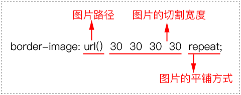
边框背景:border-image border-image属性简介 可以使用border -image 属性为边框添加背景图片。现在所有主流浏览器最新版本都支持border -image 属性。border -image 属性需要定义3 个方面的内容。1 )图片路径。2 )切割宽度:四条边的切割宽度,依次为上边、右边、下边、左边(顺时针)。3 )平铺方式:有3 种取值,分别为repeat、round 和stretch。border -image 属性,我们总结如下:1 )在制作边框背景图片时,应该制作4 条边,中间部分需要挖空。2 )边框背景图片每条边的宽度跟对应的边框宽度(即border -width )应该相同。border -image 属性的平铺方式有3 种:repeat、round 、stretch。1 )取值为repeat时,表示4 条边的小方块会不断重复,超出元素部分将会被剪切掉。2 )取值为round 时,表示4 条边的小方块会铺满。为了铺满,边框图片会压缩或拉伸。3 )取值为stretch时,表示可以使用border -image 属性为边框添加背景图片。现在所有主流浏览器最新版本都支持border -image 属性。border -image 属性需要定义3 个方面的内容。1 )图片路径。2 )切割宽度:四条边的切割宽度,依次为上边、右边、下边、左边(顺时针)。3 )平铺方式:有3 种取值,分别为repeat、round 和stretch。border -image 属性,我们总结如下:1 )在制作边框背景图片时,应该制作4 条边,中间部分需要挖空。2 )边框背景图片每条边的宽度跟对应的边框宽度(即border -width )应该相同。border -image 属性的平铺方式有3 种:repeat、round 、stretch。1 )取值为repeat时,表示4 条边的小方块会不断重复,超出元素部分将会被剪切掉。2 )取值为round 时,表示4 条边的小方块会铺满。为了铺满,边框图片会压缩或拉伸。3 )取值为stretch时,表示4 条边的小方块会拉伸,边长有多长就拉多长。
<!DOCTYPE html > <html > <head > <meta charset ="utf-8" /> <title > </title > <style type ="text/css" > div width :170px ; height :110px ; line-height :110px ; text-align : center; border :30px solid gray; margin-top :20px ; #div1 {border-image :url (img/border.png ) 30 repeat;} #div2 {border-image :url (img/border.png ) 30 round;} #div3 {border-image :url (img/border.png ) 30 stretch;} </style > </head > <body > <div id ="div1" > repeat</div > <div id ="div2" > round</div > <div id ="div3" > stretch</div > </body > </<!DOCTYPE html > <html > <head > <meta charset ="utf-8" /> <title > </title > <style type ="text/css" > div width :170px ; height :110px ; line-height :110px ; text-align : center; border :30px solid gray; margin-top :20px ; #div1 {border-image :url (img/border.png ) 30 repeat;} #div2 {border-image :url (img/border.png ) 30 round;} #div3 {border-image :url (img/border.png ) 30 stretch;} </style > </head > <body > <div id ="div1" > repeat</div > <div id ="div2" > round</div > <div id ="div3" > stretch</div > </body > </html >
border-image的派生子属性 border-image属性可以分开,分别为4条边设置相应的背景图片,这4条边的属性如下表所示。
子属性
说明
border-top-image
定义上边框背景图片
border-bottom-image
定义下边框背景图片
border-left-image
定义左边框背景图片
border-right-image
定义右边框背景图片
背景样式 背景大小:background-size
可以使用background-size属性来定义背景图片的大小
背景图片跟普通图片(即img标签)是不同的东西!width和height这两个属性只能用来定义img标签图片的大小,是不能用于控制背景图片的大小。
background-size属性取值有两种:一种是长度值,如px、em、百分比等;另外一种是使用关键字,如下表所示。
属性值
说明
cover
即“覆盖”,表示将背景图片等比缩放来填满整个元素
contain
即“容纳”,表示将背景图片等比缩放至某一边紧贴元素边沿为止
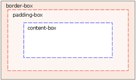
背景位置:background-origin
可以使用background-origin属性来定义背景图片是从什么地方开始平铺的,也就是定义背景图片的位置。
background-origin往往都是配合background-position来使用的,其中background-origin定义background-position相对于什么位置来定位。
属性值
说明
border-box
从边框开始平铺
padding-box
从内边距开始平铺(默认值)
content-box
从内容区开始平铺
背景剪切:background-clip
background-clip属性用于指定背景图片在元素盒子模型中的哪些区域被剪切。
属性值
说明
border-box
从边框开始剪切(默认值)
padding-box
从内边距开始剪切
content-box
从内容区开始剪切
多背景图片
在实际开发中,我们并不建议使用多背景图片,而是应该制作一张复合图片来实现。因为多一张图片就会多引发一次HTTP请求,影响页面加载速度。
<!DOCTYPE html > <html > <head > <meta charset ="utf-8" /> <title > </title > <style type ="text/css" > div width :400px ; height :200px ; border :1px solid silver; background :url (img/frame1.png ) bottom left no-repeat, url(img /frame2.png ) top right no-repeat; </style > </head > <body > <div > </div > </body > </<!DOCTYPE html > <html > <head > <meta charset ="utf-8" /> <title > </title > <style type ="text/css" > div width :400px ; height :200px ; border :1px solid silver; background :url (img/frame1.png ) bottom left no-repeat, url(img /frame2.png ) top right no-repeat; </style > </head > <body > <div > </div > </body > </html >
CSS3变形
可以使用transform属性来实现元素的变形效果。
方法
说明
translate()
平移
scale()
缩放
skew()
倾斜
rotate()
旋转
平移:translate()
单位可以为px、em和百分比等
采用的坐标系都是W3C坐标系
transform : translateX (x); transform : translateY (y); transform : translate (x, y);
<!DOCTYPE html > <html > <head > <meta charset ="utf-8" /> <title > </title > <style type ="text/css" > body {padding : 100px ;} width :200px ; height :100px ; border :1px dashed gray; width :200px ; height :100px ; color :white; background-color : rgb (30 , 170 , 250 ); opacity : 0.6 ; transform :translate (20px , 40px ); </style > </head > <body > <div id ="origin" > <div id ="current" > </div > </div > </body > </<!DOCTYPE html > <html > <head > <meta charset ="utf-8" /> <title > </title > <style type ="text/css" > body {padding : 100px ;} width :200px ; height :100px ; border :1px dashed gray; width :200px ; height :100px ; color :white; background-color : rgb (30 , 170 , 250 ); opacity : 0.6 ; transform :translate (20px , 40px ); </style > </head > <body > <div id ="origin" > <div id ="current" > </div > </div > </body > </html >
缩放:scale()
当x或y取值为0~1之间时,元素进行缩小;当x或y取值大于1时,元素进行放大。
transform : scaleX (x); transform : scaleY (y); transform : scale (x, y);
<!DOCTYPE html > <html > <head > <meta charset ="utf-8" /> <title > </title > <style type ="text/css" > width :200px ; height :100px ; border :1px dashed gray; width :200px ; height :100px ; color :white; background-color : rgb (30 , 170 , 250 ); opacity : 0.6 ; transform :scale (1.2 , 1.5 ); </style > </head > <body > <div id ="origin" > <div id ="current" > </div > </div > </body > </<!DOCTYPE html > <html > <head > <meta charset ="utf-8" /> <title > </title > <style type ="text/css" > width :200px ; height :100px ; border :1px dashed gray; width :200px ; height :100px ; color :white; background-color : rgb (30 , 170 , 250 ); opacity : 0.6 ; transform :scale (1.2 , 1.5 ); </style > </head > <body > <div id ="origin" > <div id ="current" > </div > </div > </body > </html >
倾斜:skew()
参数x表示元素在x轴方向的倾斜度数,单位为deg(即degree的缩写)。如果度数为正,则表示元素沿下x轴方向逆时针倾斜;如果度数为负,则表示元素沿x轴方向顺时针倾斜。
由于元素限定了高度为100px,而skewX()方法是沿着x轴方向倾斜的。因此只要倾斜角度不超过180°,元素都会保持100px的高度,同时为了保持倾斜,元素只能沿着x轴方向拉长本身。
transform : skewX (x); transform : skewY (y); transform : skew (x, y);
<!DOCTYPE html > <html > <head > <meta charset ="utf-8" /> <title > </title > <style type ="text/css" > width :200px ; height :100px ; border :1px dashed gray; width :200px ; height :100px ; color :white; background-color : lightskyblue; transform :skew (10deg , 20deg ); </style > </head > <body > <div id ="origin" > <div id ="current" > </div > </div > </body > </<!DOCTYPE html > <html > <head > <meta charset ="utf-8" /> <title > </title > <style type ="text/css" > width :200px ; height :100px ; border :1px dashed gray; width :200px ; height :100px ; color :white; background-color : lightskyblue; transform :skew (10deg , 20deg ); </style > </head > <body > <div id ="origin" > <div id ="current" > </div > </div > </body > </html >
旋转:rotate()
参数angle表示元素相对于中心原点旋转的度数,单位为deg。如果度数为正,则表示顺时针旋转;如果度数为负,则表示逆时针旋转。
transform : transform : rotate (angle);
<!DOCTYPE html > <html > <head > <meta charset ="utf-8" /> <title > </title > <style type ="text/css" > width :200px ; height :100px ; border :1px dashed gray; width :200px ; height :100px ; color :white; background-color : lightskyblue; transform :rotate (30deg ); </style > </head > <body > <div id ="origin" > <div id ="current" > </div > </div > </body > </<!DOCTYPE html > <html > <head > <meta charset ="utf-8" /> <title > </title > <style type ="text/css" > width :200px ; height :100px ; border :1px dashed gray; width :200px ; height :100px ; color :white; background-color : lightskyblue; transform :rotate (30deg ); </style > </head > <body > <div id ="origin" > <div id ="current" > </div > </div > </body > </html >
默认情况下,元素的中心原点位于x轴和y轴的50%处
ransform-origin属性取值有两种:一种是“长度值”;另外一种是“关键字”。当取值为长度值时,单位可以为px、em和百分比等。
关键字
百分比
说明
top left
0 0
左上
top center
50% 0
靠上居中
top right
100% 0
右上
left center
0 50%
靠左居中
center center
50% 50%
正中
right center
100% 50%
靠右居中
bottom left
0 100%
左下
bottom center
50% 100%
靠下居中
bottom right
100% 100%
右下
<!DOCTYPE html > <html > <head > <meta charset ="utf-8" /> <title > </title > <style type ="text/css" > width :200px ; height :100px ; border :1px dashed gray; margin :100px width :200px ; height :100px ; background-color : lightskyblue; transform-origin :right center; transform :rotate (30deg ); </style > </head > <body > <div id ="origin" > <div id ="current" > </div > </div > </body > </<!DOCTYPE html > <html > <head > <meta charset ="utf-8" /> <title > </title > <style type ="text/css" > width :200px ; height :100px ; border :1px dashed gray; margin :100px width :200px ; height :100px ; background-color : lightskyblue; transform-origin :right center; transform :rotate (30deg ); </style > </head > <body > <div id ="origin" > <div id ="current" > </div > </div > </body > </html >
CSS3过渡
使用transition属性来将元素的某一个属性从“一个属性值 ”在指定的时间内平滑地过渡到“另一个属性值 ”,从而来实现动画效果
凡是涉及CSS3过渡,我们都是结合:hover伪类,来实现过渡效果
transition : 过渡属性 过渡时间 过渡方式 延迟时间;
transition是一个复合属性,主要包括4个子属性
属性
说明
transition-property
对元素的哪一个属性进行操作
transition-duration
过渡的持续时间
transition-timing-function
过渡的速率方式
transition-delay
过渡的延迟时间(可选参数)
<!DOCTYPE html > <html > <head > <meta charset ="utf-8" /> <title > </title > <style type ="text/css" > div display :inline-block; padding :5px 10px ; border-radius :5px ; color :white; background-color :hotpink; cursor :pointer; transition :background-color 1s linear 0s ; div :hover background-color :purple; </style > </head > <body > <div > 从0到1系列</div > </body > </<!DOCTYPE html > <html > <head > <meta charset ="utf-8" /> <title > </title > <style type ="text/css" > div display :inline-block; padding :5px 10px ; border-radius :5px ; color :white; background-color :hotpink; cursor :pointer; transition :background-color 1s linear 0s ; div :hover background-color :purple; </style > </head > <body > <div > 从0到1系列</div > </body > </html >
过渡属性:transition-property
可以使用transition-property属性来定义过渡效果操作的是哪一个属性。
transition-property属性取值是“CSS属性”。
transition-property: 取值;<!DOCTYPE html > <html > <head > <meta charset ="utf-8" /> <title > </title > <style type ="text/css" > div display :inline-block; width :100px ; height :50px ; background-color :lightskyblue; transition-property :height; transition-duration :0.5s ; transition-timing-function :linear; transition-delay :0s ; div :hover height :100px ; </style > </head > <body > <div > </div > </body > </transition-property: 取值;<!DOCTYPE html > <html > <head > <meta charset ="utf-8" /> <title > </title > <style type ="text/css" > div display :inline-block; width :100px ; height :50px ; background-color :lightskyblue; transition-property :height; transition-duration :0.5s ; transition-timing-function :linear; transition-delay :0s ; div :hover height :100px ; </style > </head > <body > <div > </div > </body > </html >
过渡时间:transition-duration
使用transition-duration属性来定义过渡的持续时间。
transition-duration属性取值是一个时间,单位为秒(s),可以取小数。
transition-duration: 时间;<!DOCTYPE html > <html > <head > <meta charset ="utf-8" /> <title > </title > <style type ="text/css" > div display :inline-block; width :100px ; height :100px ; background-color :lightskyblue; transition-property :border-radius; transition-duration :0.5s ; transition-timing-function :linear; transition-delay :0s ; div :hover border-radius :50px ; </style > </head > <body > <div > </div > </body > </transition-duration: 时间;<!DOCTYPE html > <html > <head > <meta charset ="utf-8" /> <title > </title > <style type ="text/css" > div display :inline-block; width :100px ; height :100px ; background-color :lightskyblue; transition-property :border-radius; transition-duration :0.5s ; transition-timing-function :linear; transition-delay :0s ; div :hover border-radius :50px ; </style > </head > <body > <div > </div > </body > </html >
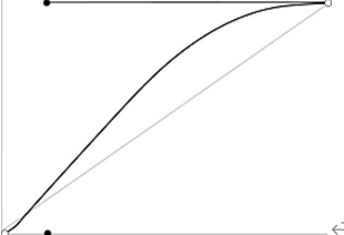
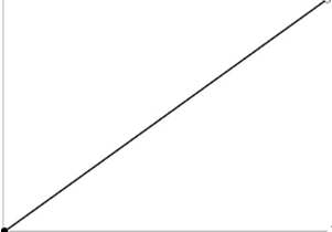
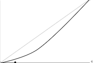
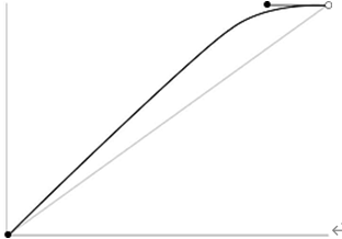
过渡方式:transition-timing-function
使用transition-timing-function属性来定义过渡方式。
transition-timing-function : 取值;
transition-timing-function属性取值共有5种,如下表所示。
属性值
说明
速率
ease
默认值,由快到慢,逐渐变慢
linear
匀速
ease-in
速度越来越快(即渐显效果)
ease-out
速度越来越慢(即渐隐效果)
ease-in-out
先加速后减速(即渐显渐隐效果)
<!DOCTYPE html > <html > <head > <meta charset ="utf-8" /> <title > </title > <style type ="text/css" > div width :100px ; height :50px ; line-height :50px ; text-align :center; margin-top :5px ; background-color :lightskyblue; transition-property :width; transition-duration :2s ; transition-delay :0s ; #div1 {transition-timing-function :linear;} #div2 {transition-timing-function :ease;} #div3 {transition-timing-function :ease-in;} #div4 {transition-timing-function :ease-out;} #div5 {transition-timing-function :ease-in-out;} div :hover width :300px ; </style > </head > <body > <div id ="div1" > linear</div > <div id ="div2" > ease</div > <div id ="div3" > ease-in</<!DOCTYPE html > <html > <head > <meta charset ="utf-8" /> <title > </title > <style type ="text/css" > div width :100px ; height :50px ; line-height :50px ; text-align :center; margin-top :5px ; background-color :lightskyblue; transition-property :width; transition-duration :2s ; transition-delay :0s ; #div1 {transition-timing-function :linear;} #div2 {transition-timing-function :ease;} #div3 {transition-timing-function :ease-in;} #div4 {transition-timing-function :ease-out;} #div5 {transition-timing-function :ease-in-out;} div :hover width :300px ; </style > </head > <body > <div id ="div1" > linear</div > <div id ="div2" > ease</div > <div id ="div3" > ease-in</div >
延迟时间:transition-delay
使用transition-delay属性来定义过渡效果的延迟时间。
transition-delay属性取值是一个时间,单位为秒(s),可以是小数,默认值为0s。也就是说,当我们没有定义transition-delay时,过渡效果就没有延迟时间。
transition-delay: 时间;<!DOCTYPE html > <html > <head > <meta charset ="utf-8" /> <title > </title > <style type ="text/css" > div display :inline-block; width :100px ; height :100px ; background-color :lightskyblue; transition-property :border-radius; transition-duration :0.5s ; transition-timing-function :linear; transition-delay : 2s ; div :hover border-radius :50px ; </style > </head > <body > <div > </div > </body > </transition-delay: 时间;<!DOCTYPE html > <html > <head > <meta charset ="utf-8" /> <title > </title > <style type ="text/css" > div display :inline-block; width :100px ; height :100px ; background-color :lightskyblue; transition-property :border-radius; transition-duration :0.5s ; transition-timing-function :linear; transition-delay : 2s ; div :hover border-radius :50px ; </style > </head > <body > <div > </div > </body > </html >
深入了解transition属性 transition-property取值为all
以使用transition属性同时对多个CSS属性来实现过渡效果
transition :all 1s linear transition :all 1s linear 0s ;
transition-delay的省略
transition-delay属性是一个可选属性,因此当transition-delay取值为0s时,这个参数可以省略。
transition :all 1s linear 0s ;transition :all transition :all 1s linear 0s ;transition :all 1s linear;
transition属性的位置
如果把transition属性写在悬浮状态内的话,移出时没有过渡效果。
div :hover border-radius :50px ;background-color :hotpink;transition :all div :hover border-radius :50px ;background-color :hotpink;transition :all 0.5s linear;
CSS3动画简介
对于transition属性来说,它只能将元素的某一个属性从一个属性值过渡到另一个属性值。
对于animation属性来说,它可以将元素的某一个属性从第1个属性值过渡到第2个属性值,然后还可以继续过渡到第3个属性值,以此类推。
transition属性(即CSS3过渡)只能实现一次性的动画效果,而animation属性(即CSS3动画)可以实现连续性的动画效果。
使用animation属性实现CSS3动画需要两步
(1)定义动画。(2)调用动画。
animation : 动画名称 持续时间 动画方式 延迟时间 动画次数 动画方向;
animation是一个复合属性,主要包括6个子属性,如下表所示。
属性
说明
animation-name
对哪一个CSS属性进行操作
animation-duration
动画的持续时间
animation-timing-function
动画的速率方式
animation-delay
动画的延迟时间
animation-iteration-count
动画的播放次数
animation-direction
动画的播放方向,正向还是反向
<!DOCTYPE html > <html > <head > <meta charset ="utf-8" /> <title > </title > <style type ="text/css" > div width :100px ; height :100px ; border-radius :50px ; background-color :red; @keyframes mycolor 0% {background-color :red;} 30% {background-color :blue;} 60% {background-color :yellow;} 100% {background-color :green;} div :hover animation :mycolor 5s linear; </style > </head > <body > <div > </div > </body > </<!DOCTYPE html > <html > <head > <meta charset ="utf-8" /> <title > </title > <style type ="text/css" > div width :100px ; height :100px ; border-radius :50px ; background-color :red; @keyframes mycolor 0% {background-color :red;} 30% {background-color :blue;} 60% {background-color :yellow;} 100% {background-color :green;} div :hover animation :mycolor 5s linear; </style > </head > <body > <div > </div > </body > </html >
@keyframes
在调用动画之前,我们必须先使用@keyframes规则来定义动画
@keyframes 动画名0 %{} 100 @keyframes 动画名0 %{} 100 %{}
0%表示动画的开始,100%表示动画的结束,0%和100%是必须的。
如果仅仅只有0%和100%这两个百分比的话,此时0%和100%可以使用关键字from和to来代替,其中0%对应from,100%对应to。
@keyframes mycolorfrom {color :red}to {@keyframes mycolorfrom {color :red}to {color :green}
动画名称:animation-name
animation-name调用的动画名需要和@keyframes规则定义的动画名完全一致(区分大小写),如果不一致将不会产生任何动画效果。
只需要把调用动画的代码放在div元素,而不是在:hover伪类中,就能在打开页面就能自动执行动画
持续时间:animation-duration
animation-duration属性取值是一个时间,单位为秒(s),可以是小数。
CSS3动画大多数时候都是配合CSS3变形一起使用,然后来实现各种绚丽复杂的动画效果。
animation-duration: 时间;<!DOCTYPE html > <html > <head > <meta charset ="utf-8" /> <title > </title > <style type ="text/css" > @keyframes mytranslate 100% {transform :translateX (160px );} display :inline-block; width :200px ; border :1px solid silver; width :40px ; height :40px ; margin-top :10px ; border-radius :20px ; background-color :red; animation-name :mytranslate; animation-timing-function :linear; #div1 {animation-duration :2s ;} #div2 {animation-duration :4s ;} </style > </head > <body > <div id ="container" > <div id ="div1" > </div > <div id ="div2" > </div > </div > </body > </animation-duration: 时间;<!DOCTYPE html > <html > <head > <meta charset ="utf-8" /> <title > </title > <style type ="text/css" > @keyframes mytranslate 100% {transform :translateX (160px );} display :inline-block; width :200px ; border :1px solid silver; width :40px ; height :40px ; margin-top :10px ; border-radius :20px ; background-color :red; animation-name :mytranslate; animation-timing-function :linear; #div1 {animation-duration :2s ;} #div2 {animation-duration :4s ;} </style > </head > <body > <div id ="container" > <div id ="div1" > </div > <div id ="div2" > </div > </div > </body > </html >
动画方式:animation-timing-function
使用animation-timing-function属性来定义动画的动画方式。所谓“动画方式”,指的是动画在过渡时间内的速率变化方式。
animation-timing-function属性取值共有5种,这个跟CSS3过渡的 transition-timing-function是一样的
animation-timing-function: 取值;<!DOCTYPE html > <html > <head > <meta charset ="utf-8" /> <title > </title > <style type ="text/css" > @keyframes mytransform 100% {width :300px ;} div width :100px ; height :50px ; line-height :50px ; text-align :center; margin-top :10px ; border-radius :0 ; background-color :lightskyblue; animation-name :mytransform; animation-duration :5s ; #div1 {animation-timing-function :linear;} #div2 {animation-timing-function :ease;} #div3 {animation-timing-function :ease-in;} #div4 {animation-timing-function :ease-out;} #div5 {animation-timing-function :ease-in-out} </style > </head > <body > <div id ="div1" > linear</div > <div id ="div2" > ease</div > <div id ="div3" > ease-in</div > <div id ="div4" > ease-out</div > <div id ="div5" > ease-in-out</div > </body > </animation-timing-function: 取值;<!DOCTYPE html > <html > <head > <meta charset ="utf-8" /> <title > </title > <style type ="text/css" > @keyframes mytransform 100% {width :300px ;} div width :100px ; height :50px ; line-height :50px ; text-align :center; margin-top :10px ; border-radius :0 ; background-color :lightskyblue; animation-name :mytransform; animation-duration :5s ; #div1 {animation-timing-function :linear;} #div2 {animation-timing-function :ease;} #div3 {animation-timing-function :ease-in;} #div4 {animation-timing-function :ease-out;} #div5 {animation-timing-function :ease-in-out} </style > </head > <body > <div id ="div1" > linear</div > <div id ="div2" > ease</div > <div id ="div3" > ease-in</div > <div id ="div4" > ease-out</div > <div id ="div5" > ease-in-out</div > </body > </html >
延迟时间:animation-delay
使用animation-delay属性来定义动画的延迟时间
animation-delay属性取值是一个时间,单位为秒(s),可以为小数,其中默认值为0s。也就是说,当我们没有定义animation-delay时,动画就没有延迟时间。
播放次数:animation-iteration-count
animation-iteration-count属性取值有两种:一种是“正整数”;另外一种是“infinite”。当取值是n(正整数)时,表示动画播放n次;当取值为infinite时,表示动画播放无数次,也就是循环播放。
animation-iteration-count: 取值;<!DOCTYPE html > <html > <head > <meta charset ="utf-8" /> <title > </title > <style type ="text/css" > @keyframes mytranslate 50% {transform :translateX (160px );} width :40px ; height :40px ; border-radius :20px ; background-color :red; animation-name :mytranslate; animation-timing-function :linear; animation-duration :2s ; animation-iteration-count :infinite; display :inline-block; width :200px ; border :1px solid silver; </style > </head > <body > <div id ="container" > <div id ="ball" > </div > </div > </body > </animation-iteration-count: 取值;<!DOCTYPE html > <html > <head > <meta charset ="utf-8" /> <title > </title > <style type ="text/css" > @keyframes mytranslate 50% {transform :translateX (160px );} width :40px ; height :40px ; border-radius :20px ; background-color :red; animation-name :mytranslate; animation-timing-function :linear; animation-duration :2s ; animation-iteration-count :infinite; display :inline-block; width :200px ; border :1px solid silver; </style > </head > <body > <div id ="container" > <div id ="ball" > </div > </div > </body > </html >
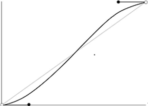
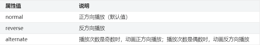
播放方向:animation-direction
animation-direction属性在实际开发中用得很少
animation-direction属性取值有3个,如下表所示。
播放状态:animation-play-state animation-play-state : 取值;
animation-play-state属性只有2个取值,如下表所示。
属性值
说明
running
播放(默认值)
paused
暂停
多列布局 列数:column-count
定义多列布局的列数。
column-count属性取值有2种,如下表所示。
属性值
说明
auto
列数由column-width属性决定(默认值)
n(正整数)
自动划分为n列
body width :400px ;padding :10px ;border :1px solid silver;column-count :body width :400px ;padding :10px ;border :1px solid silver;column-count :3 ;
列宽:column-width
定义多列布局中每一列的宽度。
column-width属性取值有2种,如下表所示。
属性值
说明
auto
列数由column-count属性决定(默认值)
长度值
单位可以为px、em和百分比等
间距:column-gap
定义列与列之间的间距。
column-gap属性取值有2个,如下表所示。
属性值
说明
normal
浏览器默认长度值
长度值
单位可以为px、em和百分比等
边框:column-rule
定义列与列之间的边框样式。
column-rule : width style color;column-rule :column-rule : width style color;column-rule :1px dashed red;
column-rule属性跟border属性是非常相似的,它也是一个复合属性,由3个子属性组成。
column-rule-width:定义边框的宽度。
column-rule-style:定义边框的样式。
column-rule-color:定义边框的颜色。
跨列:column-span
实现多列布局的跨列效果
跨列在CSS3多列布局中也是很常见的效果。
column-span属性取值只有2种,如下表所示。
属性值
说明
none
不跨列
all
跨所有列(跟none相反)
滤镜效果 亮度:brightness()
亮度滤镜可以减弱或增强图片的亮度。
brightness()方法的取值是一个百分比,其中0%~100%表示减弱图片的亮度,例如0%就是完全黑色。100%以上表示增强图片的亮度,例如200%就是将亮度提高2倍。
filter : filter : brightness (百分比);
灰度:grayscale()
灰度滤镜可以将彩色图片转换成黑白图片
grayscale()方法的取值是一个百分比,其中0%表示不做任何修改,100%表示完全灰度(即黑白图片)。
filter : filter : grayscale (百分比)
复古:sepia()
实现复古滤镜效果。复古滤镜,也叫褐色滤镜。
sepia()方法的取值是一个百分比,取值范围为0%~100%。其中,0%表示没有转换,100%表示复古效果。
filter : filter : sepia (百分比)
反色:invert()
实现反色滤镜效果的。反色,指的是将红、绿、蓝3个通道的像素取各自的相反值。
invert()方法的取值是一个百分比,取值范围为0%~100%。其中,0%表示没有转换,100%表示反转所有颜色。
filter : filter : invert (百分比)
旋转(色相):hue-rotate()
实现色相旋转的滤镜效果。
hue-rotate()方法的取值是一个度数,单位为deg(即degree的缩写)。其中,0deg表示不旋转,360deg表示旋转360°,也就是相当于一个循环。
filter : hue -filter : hue -rotate (度数)
阴影:drop-shadow()
drop-shadow()方法的参数有4个,每一个参数说明如下。
(1)x-offset:定义水平阴影的偏移距离,可以使用负值。由于CSS3采用的是W3C坐标系,因此x-offset取值为正时,向右偏移;取值为负时,向左偏移。
(2)y-offset:定义垂直阴影的偏移距离,可以使用负值。由于CSS3采用的是W3C坐标系,因此y-offset取值为正时,向下偏移;取值为负时,向上偏移。
(3)blur:定义阴影的模糊半径,只能为正值。
(4)color:定义阴影的颜色。
filter : drop -shadow(x-offset y-offset blur color)#after filter :drop -shadow(5 px 5 px filter : drop -shadow(x-offset y-offset blur color)#after filter :drop -shadow(5 px 5 px 10 px red);
透明度:opacity()
opacity()方法的取值是一个百分比,取值范围为0%~100%。其中,0%表示完全透明,100%表示完全不透明。
filter : filter : opacity (百分比)
模糊度:blur()
使用blur()方法来实现模糊度滤镜效果,也就是“马赛克”。
blur()方法的取值是一个像素值,取值越大,模糊效果越明显。
filter : blur (像素)blur (filter : blur (像素)blur (5px );
对比度:contrast()
contrast()方法的取值是一个百分比。其中,0%~100%表示减弱对比度,例如0%则是灰度图片。100%以上表示增强对比度,例如200%表示增强对比度为原来的2倍。
filter : filter : contrast (百分比)
饱和度:saturate()
saturate()方法的取值是一个百分比。其中,0%~100%表示减弱饱和度,100%以上表示增强饱和度。
filter : filter : saturate (百分比)
多种滤镜
为某个元素同时定义多种滤镜效果,我们可以将filter属性的取值设置为一个“值列表”的形式来实现。
在值列表中,两个值之间需要用空格隔开。
filter : 值列表;#after filter :brightness (120% ) contrast (200% ) blur (filter : 值列表;#after filter :brightness (120% ) contrast (200% ) blur (1px );
弹性盒子模型
通过弹性盒子模型,我们可以轻松地创建自适应浏览器窗口的“流动布局”以及自适应字体大小的弹性布局,使得响应式布局的实现更加容易。
在使用弹性盒子模型之前,必须为父元素定义“display:flex;”或“display:inline-flex;”,这个父元素才具有弹性盒子模型的特点。
子元素宽度之和小于父元素宽度。因此,所有子元素最终的宽度就是原来定义的宽度。
子元素宽度之和大于父元素宽度。因此,子元素会按比例来划分宽度。
响应式布局的关键是使用@media来实现媒体查询
放大比例:flex-grow
定义弹性盒子内部子元素的放大比例。也就是当所有子元素宽度之和小于父元素的宽度时,子元素如何分配父元素的剩余空间。
在使用flex-grow时,一般是不需要对弹性盒子内部的子元素定义宽度或高度的,否则会影响flex容器的比例分配。
flex-grow属性取值是一个数值,默认值为0。当取值为0时,表示不索取父元素的剩余空间。当取值大于0时,表示索取父元素的剩余空间(即子元素放大)。取值越大,索取得越多。
由于所有子元素都没有指定宽度,因此我们可以看成:所有子元素宽度之和小于父元素的宽度。接着我们只需要使用flex-grow属性给每一个子元素指定一个值,然后浏览器就会自动计算每个子元素所占的比例,自动划分宽度。
举个例子,父元素下有两个子元素:A和 B。其中父元素宽400px,A宽为100px,B宽为200px。那么父元素的剩余空间为400-100-200=100px。
(1)如果A和B都不索取,也就是A和B的flex-grow为0,则父元素的剩余空间为100px。
(2)如果A索取,B不索取。其中A设置flex-grow:1,那么最终A的宽为100+100=200px,B的宽不变还是200px。
(3)如果A和B同时索取剩余空间,其中A设置flex-grow:1,B设置flex-grow:1,那么最终A的宽为100+100×1/(1+1)=150px,B的宽为200+100×1/(1+1)=250px。
(4)如果A和B同时索取剩余空间,其中A设置flex-grow:1,B设置flex-grow:3,那么最终A的宽为100+100×1/(1+3)=125px,B的宽为200+100×3/(1+3)=275px。
<!DOCTYPE html > <html > <head > <meta charset ="utf-8" /> <title > </title > <style type ="text/css" > display :flex; width :200px ; height :150px ; background :red; flex-grow : 1 ; background :blue; flex-grow : 2 ; background :orange; flex-grow : 1 ; </style > </head > <body > <div id ="wrapper" > <div id ="box1" > </div > <div id ="box2" > </div > <div id ="box3" > </div > </div > </body > </<!DOCTYPE html > <html > <head > <meta charset ="utf-8" /> <title > </title > <style type ="text/css" > display :flex; width :200px ; height :150px ; background :red; flex-grow : 1 ; background :blue; flex-grow : 2 ; background :orange; flex-grow : 1 ; </style > </head > <body > <div id ="wrapper" > <div id ="box1" > </div > <div id ="box2" > </div > <div id ="box3" > </div > </div > </body > </html >
缩小比例:flex-shrink
当所有子元素宽度之和大于父元素的宽度时,子元素如何缩小自己的宽度。
flex-shrink属性取值是一个数值,默认值为1。当取值为0时,表示子元素不缩小。当取值大于1时,表示子元素按一定的比例缩小。取值越大,缩小得越厉害。
只有当所有子元素宽度之和小于弹性盒子的宽度时,flex-grow才会生效,而此时flex-shrink无效;只有当所有子元素宽度之和大于弹性盒子的宽度时,flex-shrink属性才会生效,而此时flex-grow无效。也就是说,flex-grow和flex-shrink是互斥的,不可能同时生效。
(1)对于定义了flex-grow:0或者flex-shrink:0;的子元素,宽度为原来定义的宽度,并且不会参与划分。
(2)flex-grow的默认值为0,而flex-shrink的默认值为1。
在实际开发中,我们更多的是使用flex-grow属性,很少会用flex-shrink属性。
举个例子,父元素下有两个子元素:A和 B。其中父元素宽400px,A宽为200px,B宽为300px。那么A和B宽度之和超出父元素宽度为:200+300-400=100px。
(1)如果A和B都不缩小,也就是A和B都设置flex-shrink:0,那么会有100px的宽度超出父元素。
(2)如果A不缩小,B缩小。其中A设置flex-shrink:0;,B设置flex-shrink:1;(默认值)。那么最终A的宽不变还是200px,B的宽为300-100=200px(自身宽度-超出父元素的宽度)。
(3)如果A和B同时缩小,其中A设置flex-shrink:1,B设置flex-shrink:1,那么最终A的宽为200-100×(200×1)/(200×1+300×1)=160px(A自身宽度-A减小的宽度),B的宽为300-100×(300×1)/(200×1+300×1)=240px(B自身宽度-B减小的宽度)。
(4)如果A和B同时缩小,其中A设置flex-shrink:3,B设置flex-shrink:2,那么最终A的宽为200-100×(200×3)/(200×3+300×2)=150px(A自身宽度-A减小的宽度),B的宽为300-100×(300×2)/(200×3+300×2)=250px(B自身宽度-B减小的宽度)。
元素宽度:flex-basis
定义弹性盒子内部子元素的在分配空间之前,该子元素所占的空间大小。浏览器会根据这个属性,然后计算父元素是否有多余空间。
在弹性盒子中,flex-basis的语义会比width好一点。flex-basis和width都可以用来设置子元素的宽度,但是我们应该使用flex-basis而不是width,这也是为了更好的语义化。
flex-basis属性取值有两个:一个是“auto”,即该子元素的宽度是根据内容多少来定的;另外一个是“长度值”,单位可以为px、em和百分比等。
flex-basis属性用来设置子元素的宽度,当然,width属性也可以用来设置子元素的宽度。如果某一个子元素同时设置flex-basis和width,那么flex-basis的值会覆盖width的值。
flex-basis是针对弹性盒子(父元素)下的子元素而已的,不能用于设置弹性盒子的宽度。
复合属性:flex
可以使用flex属性来同时设置flex-grow、flex-shrink、flex-basis这3个属性。
参数grow是flex-grow的取值,参数shrink是flex-shrink的取值,参数basis是flex-basis的取值。因此,flex属性的默认值为“0 1 auto”。
在实际开发中,优先使用flex属性,而不是单独写flex-grow、flex-shrink、flex-basis这3个属性。
flex:1;”其实等价于“flex:1 1 auto;”,而“flex:2;”等价于“flex:2 1 auto;”。也就是说flex取值只有一个数时,表示只设置了flex-grow这个属性的取值。事实上,在实际开发中我们一般也是只需要设置flex-grow属性,很少用得上另外两个属性。
<!DOCTYPE html > <html > <head > <meta charset ="utf-8" /> <title > </title > <style type ="text/css" > display :flex; width :200px ; height :150px ; background :red; flex : 1 ; background :blue; flex : 2 ; background :orange; flex : 1 ; </style > </head > <body > <div id ="wrapper" > <div id ="box1" > </div > <div id ="box2" > </div > <div id ="box3" > </div > </div > </body > </<!DOCTYPE html > <html > <head > <meta charset ="utf-8" /> <title > </title > <style type ="text/css" > display :flex; width :200px ; height :150px ; background :red; flex : 1 ; background :blue; flex : 2 ; background :orange; flex : 1 ; </style > </head > <body > <div id ="wrapper" > <div id ="box1" > </div > <div id ="box2" > </div > <div id ="box3" > </div > </div > </body > </html >
排列方向:flex-direction
定义弹性盒子内部“子元素”的排列方向。也就是定义子元素是横着排,还是竖着排。
flex-direction属性是在弹性盒子(即父元素)上定义的。
flex-direction属性取值有4个,如下表所示。
属性值
说明
row
横向排列(默认值)
row-reverse
横向反向排列
column
纵向排列
column-reverse
纵向反向排列
<!DOCTYPE html > <html > <head > <meta charset ="utf-8" /> <title > </title > <style type ="text/css" > display :flex; flex-direction :row-reverse; width :200px ; height :150px ; height :150px ; line-height : 150px ; text-align : center; font-size :30px ; color :white; background :red; flex : 1 ; background :blue; flex : 2 ; background :orange; flex : 3 ; </style > </head > <body > <div id ="wrapper" > <div id ="box1" > 1</div > <div id ="box2" > 2</div > <div id ="box3" > 3</div > </div > </body > </<!DOCTYPE html > <html > <head > <meta charset ="utf-8" /> <title > </title > <style type ="text/css" > display :flex; flex-direction :row-reverse; width :200px ; height :150px ; height :150px ; line-height : 150px ; text-align : center; font-size :30px ; color :white; background :red; flex : 1 ; background :blue; flex : 2 ; background :orange; flex : 3 ; </style > </head > <body > <div id ="wrapper" > <div id ="box1" > 1</div > <div id ="box2" > 2</div > <div id ="box3" > 3</div > </div > </body > </html >
多行显示:flex-wrap
使用flex-wrap属性来定义弹性盒子内部“子元素”是单行显示还是多行显示。
flex-wrap属性常见取值有3个,如下表所示。
属性值
说明
nowrap
单行显示(默认值)
wrap
多行显示,也就是换行显示
wrap-reverse
多行显示,但是却是反向
<!DOCTYPE html > <html > <head > <meta charset ="utf-8" /> <title > </title > <style type ="text/css" > display : flex; color : white; font-size :24px ; width :400px ; height : 100px ; line-height :50px ; border :1px solid gray; text-align : center; .wrapper1 div ,.wrapper2 div ,.wrapper3 div height : 50% ; width : 50% ; .red {background : red;} .green {background : green;} .blue {background : blue;} .wrapper1 {flex-wrap : nowrap;} .wrapper2 {flex-wrap : wrap;} .wrapper3 {flex-wrap : wrap-reverse;} </style > </head > <body > <h3 > 1、flex-wrap:nowrap(默认值)</h3 > <div class ="wrapper1" > <div class ="red" > 1</div > <div class ="green" > 2</div > <div class ="blue" > 3</div > </div > <h3 > 2、flex-wrap:wrap</h3 > <div class ="wrapper2" > <div class ="red" > 1</div > <div class ="green" > 2</div > <div class ="blue" > 3</div > </div > <h3 > 3、flex-wrap:wrap-reverse</h3 > <div class ="wrapper3" > <div class ="red" > 1</div > <div class ="green" > 2</div > <div class ="blue" > 3</div > </div > </body > </<!DOCTYPE html > <html > <head > <meta charset ="utf-8" /> <title > </title > <style type ="text/css" > display : flex; color : white; font-size :24px ; width :400px ; height : 100px ; line-height :50px ; border :1px solid gray; text-align : center; .wrapper1 div ,.wrapper2 div ,.wrapper3 div height : 50% ; width : 50% ; .red {background : red;} .green {background : green;} .blue {background : blue;} .wrapper1 {flex-wrap : nowrap;} .wrapper2 {flex-wrap : wrap;} .wrapper3 {flex-wrap : wrap-reverse;} </style > </head > <body > <h3 > 1、flex-wrap:nowrap(默认值)</h3 > <div class ="wrapper1" > <div class ="red" > 1</div > <div class ="green" > 2</div > <div class ="blue" > 3</div > </div > <h3 > 2、flex-wrap:wrap</h3 > <div class ="wrapper2" > <div class ="red" > 1</div > <div class ="green" > 2</div > <div class ="blue" > 3</div > </div > <h3 > 3、flex-wrap:wrap-reverse</h3 > <div class ="wrapper3" > <div class ="red" > 1</div > <div class ="green" > 2</div > <div class ="blue" > 3</div > </div > </body > </html >
复合属性:flex-flow
使用flex-flow属性来同时设置flex-direction、flex-wrap这两个属性。
在实际开发中,我们更倾向于使用flex-flow这种简写形式。
参数direction是flex-direction的取值,参数wrap是flex-wrap的取值。因此,flex-flow属性的默认值为“row nowrap”。
flex-flow : direction wrap;
排列顺序:order
使用order属性来定义弹性盒子内部“子元素”的排列顺序。
order属性取值是一个正整数,即1、2、3等。****
order :整数flex : 1 ;order :order :整数flex : 1 ;order :2 ;
水平对齐:justify-content
使用justify-content属性来定义弹性盒子内部子元素在“横轴”上的对齐方式。
justify-content属性有很多,常见的如下表所示。
属性值
说明
flex-start
所有子元素在左边(默认值)
center
所有子元素在中间
flex-end
所有子元素在右边
space-between
所有子元素平均分布
space-around
所有子元素平均分布,但两边留有一定间距
<!DOCTYPE html > <html > <head > <meta charset ="utf-8" > <title > </title > <style type ="text/css" > display : flex; flex-flow : row nowrap; background-color :lightskyblue; margin-bottom :5px ; width : 80px ; padding :10px ; text-align : center; background-color :hotpink; box-sizing : border-box; .start {justify-content : flex-start;} .center {justify-content : center;} .end {justify-content : flex-end;} .between {justify-content : space-between;} .around {justify-content : space-around;} </style > </head > <body > <h3 > 1、flex-start:</h3 > <div class ="flex start" > <div class ="item" > 1</div > <div class ="item" > 2</div > <div class ="item" > 3</div > <div class ="item" > 4</div > </div > <h3 > 2、center:</h3 > <div class ="flex center" > <div class ="item" > 1</div > <div class ="item" > 2</div > <div class ="item" > 3</div > <div class ="item" > 4</div > </div > <h3 > 3、flex-end:</h3 > <div class ="flex end" > <div class ="item" > 1</div > <div class ="item" > 2</div > <div class ="item" > 3</div > <div class ="item" > 4</div > </div > <h3 > 4、space-between:</h3 > <div class ="flex between" > <div class ="item" > 1</div > <div class ="item" > 2</div > <div class ="item" > 3</div > <div class ="item" > 4</div > </div > <h3 > 5、space-around:</h3 > <div class ="flex around" > <div class ="item" > 1</div > <div class ="item" > 2</div > <div class ="item" > 3</div > <div class ="item" > 4</div > </div > </body > </<!DOCTYPE html > <html > <head > <meta charset ="utf-8" > <title > </title > <style type ="text/css" > display : flex; flex-flow : row nowrap; background-color :lightskyblue; margin-bottom :5px ; width : 80px ; padding :10px ; text-align : center; background-color :hotpink; box-sizing : border-box; .start {justify-content : flex-start;} .center {justify-content : center;} .end {justify-content : flex-end;} .between {justify-content : space-between;} .around {justify-content : space-around;} </style > </head > <body > <h3 > 1、flex-start:</h3 > <div class ="flex start" > <div class ="item" > 1</div > <div class ="item" > 2</div > <div class ="item" > 3</div > <div class ="item" > 4</div > </div > <h3 > 2、center:</h3 > <div class ="flex center" > <div class ="item" > 1</div > <div class ="item" > 2</div > <div class ="item" > 3</div > <div class ="item" > 4</div > </div > <h3 > 3、flex-end:</h3 > <div class ="flex end" > <div class ="item" > 1</div > <div class ="item" > 2</div > <div class ="item" > 3</div > <div class ="item" > 4</div > </div > <h3 > 4、space-between:</h3 > <div class ="flex between" > <div class ="item" > 1</div > <div class ="item" > 2</div > <div class ="item" > 3</div > <div class ="item" > 4</div > </div > <h3 > 5、space-around:</h3 > <div class ="flex around" > <div class ="item" > 1</div > <div class ="item" > 2</div > <div class ="item" > 3</div > <div class ="item" > 4</div > </div > </body > </html >
垂直对齐:align-items
使用align-items属性来定义弹性盒子内部子元素在“纵轴”上的对齐方式。
align-items属性有很多,常见的如下表所示。
属性值
说明
flex-start
所有子元素在上边(默认值)
center
所有子元素在中部
flex-end
所有子元素在下边
baseline
所有子元素在父元素的基线上
strecth
拉伸子元素以适应父元素高度
其他样式 outline属性
使用outline属性来定义表单中文本框的轮廓线样式。
第1个值指的是轮廓线宽度(outline-width),第2个值指的是轮廓线样式(outline-sytle),第3个值指的是轮廓线颜色(outline-color)。
outline属性相当有用,特别是在美化搜索框样式的时候经常用到。
outline: width style color;<!DOCTYPE html > <html > <head > <meta charset ="utf-8" /> <title > </title > <style type ="text/css" > input [type="text" ] :focus outline :1px solid red; </style > </head > <body > <input id ="txt" type ="text" > </body > </outline: width style color;<!DOCTYPE html > <html > <head > <meta charset ="utf-8" /> <title > </title > <style type ="text/css" > input [type="text" ] :focus outline :1px solid red; </style > </head > <body > <input id ="txt" type ="text" > </body > </html >
initial取值
使用“initial”这个值来直接将某个CSS属性重置为它的默认值,并不需要事先这个CSS属性的默认值是多少,因为浏览器会自动设置的。
property是一个CSS属性名,“property:initial;”表示设置property这个属性的取值为默认值。此外,initial取值可以用于任何HTML元素上的任何CSS属性。
property: initial<!DOCTYPE html > <html > <head > <meta charset ="utf-8" /> <title > </title > <style type ="text/css" > div {color :red;} #select {color :initial;} </style > </head > <body > <div > 绿叶学习网</div > <div > 绿叶学习网</div > <div id ="select" > 绿叶学习网</div > </body > </html > <!DOCTYPE html > <html > <head > <meta charset ="utf-8" /> <title > </title > <style type ="text/css" > div {color :red;} #select {color :initial;} </style > </head > <body > <div > 绿叶学习网</div > <div > 绿叶学习网</div > <div id ="select" > 绿叶学习网</div > </body > </property: initial<!DOCTYPE html > <html > <head > <meta charset ="utf-8" /> <title > </title > <style type ="text/css" > div {color :red;} #select {color :initial;} </style > </head > <body > <div > 绿叶学习网</div > <div > 绿叶学习网</div > <div id ="select" > 绿叶学习网</div > </body > </html > <!DOCTYPE html > <html > <head > <meta charset ="utf-8" /> <title > </title > <style type ="text/css" > div {color :red;} #select {color :initial;} </style > </head > <body > <div > 绿叶学习网</div > <div > 绿叶学习网</div > <div id ="select" > 绿叶学习网</div > </body > </html >
calc()函数
使用calc()函数通过“计算”的方式来定义某一个属性的取值。’
在实际开发中,calc()函数非常好用,特别是在自适应布局中涉及不同单位之间的运算时用得非常多。
我们可以使用calc()函数以计算的方式给元素的width、margin、padding、font-size等来定义属性值。对于calc()函数,有以下5条运算规则。
(1)只能使用加(+)、减(-)、乘(*)和除(/)这4种运算。
(2)可以使用px、em、rem、百分比等单位。
(3)可以混合使用各种单位进行运算。
(4)表达式中有加号(+)和减号(-)时,其前后必须有空格。
(5)表达式中有乘号(*)和除号(/)时,其前后可以没有空格,但建议保留。
<!DOCTYPE html > <html > <head > <meta charset ="utf-8" /> <title > </title > <style type ="text/css" > *{margin : 0 ; padding : 0 ;} float : left; width : calc (100% / 3 - 5px ); margin-right : calc (5px * 3 /2 ); margin-bottom : calc (5px * 3 /2 ); height : 60px ; line-height : 60px ; text-align : center; font-size : 24px ; background : #EEEEEE ; color : #333333 ; .col-3 :nth-child (3 ){margin-right : 0 ;} </style > </head > <body > <div class ="container" > <div class ="col-3" > 1</div > <div class ="col-3" > 2</div > <div class ="col-3" > 3</div > </div > </body > </<!DOCTYPE html > <html > <head > <meta charset ="utf-8" /> <title > </title > <style type ="text/css" > *{margin : 0 ; padding : 0 ;} float : left; width : calc (100% / 3 - 5px ); margin-right : calc (5px * 3 /2 ); margin-bottom : calc (5px * 3 /2 ); height : 60px ; line-height : 60px ; text-align : center; font-size : 24px ; background : #EEEEEE ; color : #333333 ; .col-3 :nth-child (3 ){margin-right : 0 ;} </style > </head > <body > <div class ="container" > <div class ="col-3" > 1</div > <div class ="col-3" > 2</div > <div class ="col-3" > 3</div > </div > </body > </html >
overflow-x和overflow-y
overflow-x属性用来定义内容超出元素“宽度”时应该如何处理,而overflow-y属性用来定义内容超出元素“高度”时应该如何处理。
overflow-x : 取值;overflow-x : 取值;overflow-y : 取值;
overflow-x和overflow-y这两个属性都有4种取值,如下表所示。
属性值
说明
visible
内容超出时,不剪切内容,也不添加滚动条
hidden
内容超出时,剪切内容,但只显示y轴滚动条而不显示x轴滚动条
scroll
内容超出时,显示所有滚动条
auto
跟scroll效果一样
属性值
说明
visible
内容超出时,不剪切内容,也不添加滚动条
hidden
内容超出时,剪切内容,但只显示x轴滚动条而不显示y轴滚动条
scroll
内容超出时,显示所有滚动条
auto
跟scroll效果一样
#view display :inline-block;width :160px ;height :160px ;background-color :#F1F1F1 ;border :1px solid gray;#view display :inline-block;width :160px ;height :160px ;background-color :#F1F1F1 ;border :1px solid gray;overflow-x :visible;
pointer-events属性
使用pointer-events属性来定义元素是否禁用鼠标单击事件。pointer-events属性是一个与JavaScript有关的属性。
pointer-events属性取值只有2个,如下表所示。
属性值
说明
auto
不禁用鼠标单击事件(默认值)
none
禁用鼠标单击事件
.disable pointer-events : none;color :.disable pointer-events : none;color :#666666 ;